Wearables, hardware, and beyond apps.
Creator of Aiverse

Collection of all Consumer AI
The breakdown
The ULTIMATE deep dive into AI wearables, your daily wear swag. It’s a gold rush. People are running to build THE wearable, and there can only be a few winners - given that there’s only so many things you can wear at a time.
We’re breaking down the top 8 consumer AI products —
Pin: Humane,
Pocket Device: Rabbit,
Pendant: Tab, Rewind’s Limitless,
(New) iPhone: [a secret trio product], ReALM,
Glasses: Meta’s Ray Bans, Brilliant’s Frame
Real Tony Stark stuff.
Let's dive into what's actually brewing inside…
1. Humane ai pin
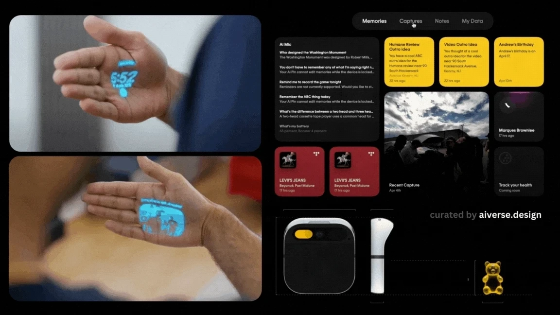
All AI-UX interactions in Humane ai pin — source: author
Overview
It’s a hardware marvel. So compact with so many features/possibilities!
They’re taking Siri out for a walk—literally. They are building an AI assistant; more conversational, less screen & with more context about your day-to-day life. It was recently launched and oh boy, it’s been a blood bath. The critics have been brutal! I, on the other hand, believe in Humane, in its potential. The execution though...umm is getting there.
Execution can catch up, innovation takes time.
The Game-changer move
They are building the operating system, CosmOS - an aiOS. The intention: replace a smartphone.Being able to connect multiple LLMs and services.Use on any other device, not limited to ai pin.
I think the underlying technology they are building (as initially promised) was the connection of APIs. One device which links all your apps - one place to take actions from using natural language. However, it seems that got lost in the launch and reviews…?
AI-UX Interactions
Voice, Touch, Spatial gestures, Camera — truly a marvel.One finger hold to send a voice command.Double finger hold to enter interpreter mode (real-time translation).Trackpad for touch gestures.
Projects monochrome images (i.e., “Laser Ink Display”) on surfaces such as the palm of your hand to display simple content such as time, text message, temperature, alerts, and more.7 years ago a device called Circet was launched with a projector to display on your arm. The major problem? The projected screen is as bright as your skin in light — meaning on a sunny day you don’t see anything.If you just want to watch something fun - this review is 🤣
You can interact with the projected screen with gesturesTowards you/Away from you is go out/into the UI screens.Rotate your palm to “hover” over a UI button.Pinch to “click” the hovered button.Clench palm to go back.
Voice command starting with “Look..” to use the camera as input. Look that’s good but is it too many interactions to remember?Voice output can be interrupted to a UI display by bringing your hand in front of the device.A small notification light indicator.
2. Rabbit’s R1

Rabbit R1 — Outer case, interactions and visuals — source: author
Overview
For now the R1 is chatGPT in an orange box. It’s a toy but with learning capabilities (a coming soon feature).
Product launched (watch launch video)
What a beautifully designed piece of hardware — teenage engineering strikes again!
It’s similar to a Tesla which learns about the roads and situations as humans drive it around. Rabbit learns about navigating interfaces and how you as a user uses it to automatically do it in the future.
The Game-changer move
LLMs are Large Language Models that understand natural language really well. That’s the norm, right? Everyone knows this. Agents, the upcoming AI fad, can take actions on your behalf. But they don’t perform a task they aren’t designed for.
Enter into the scene — “LAMs” a.k.a Large Action Models, the unique selling point for R1.
LAMs not only understand you, but can also take action.
“Call me an Uber and message Lizzy about tomorrow’s ticket, oh and also add carrots to the grocery list”
*magic magic magic*
The deeds have been done before you can finish your sentence (in the demo-land universe of idealism)
It’s like an intuitive companion. It triggers actions across all devices and from any device. It’s trained on your actions.
Cons: Currently limited to only 4 apps (Uber, Doordash, Midjourney, Spotify). For rest of the apps, the UX needs to be built out in the Rabbit R1.
Fun fact: They don’t use APIs to link to the other apps. You open their web portal which is like a virtual machine where you can open apps and the Rabbit interacts with that interface
AI-UX Interactions
The camera to see your surroundings, at your will. The fun part is that is flips, so it acts as both the front and the back camera.
Push to Talk button.
Scroll wheel (just because? touch scrolling works too).
Hold button + scrolling to take increase/decrease actions.
Hold the device sideways to input via keyboard.
A web portal to login to other apps (which “records” your flow to teach the Rabbit how to use a specific app).
The response of the R1 after you’ve completed saying something is instant. Even though the output takes time, but the device acknowledges your input immediately (Humane doesn’t).
Cons: You interact with it like your phone. The friction to use your phone vs Rabbit R1 is the same.
What if you had to redesign the Rabbit R1? What would it be? Watch this funny video! 🤣
3. Tab (now Friend)
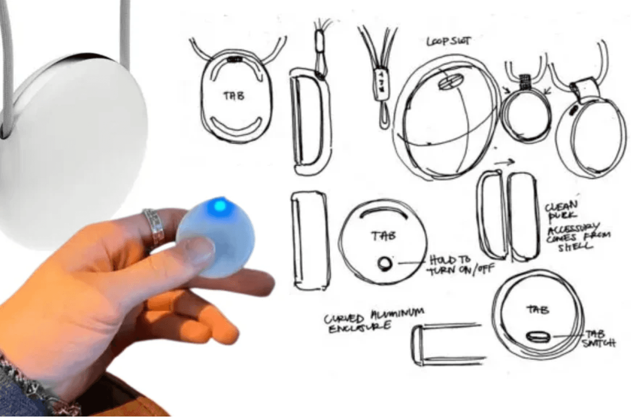
Tab product, ideation sketches — source: author
Overview
It’s a pendant which listens to everything happening around you. Only audio, no camera/visuals. Not a 100% privacy invasion, phew?Product still in the making.They initially positioned themselves as an AI assistant you can wear around your neck.Look back on anything that has happened in your life.Ask questions “what happened on that day, what did that mean?”
But not anymore… (a genius move?)
The Game-changer move
In a recent talk, the founder mentioned they are not trying to build an assistant anymore. It’s a race which Apple can win easily. For starters, there’s no iMessage API, the assistant won’t have access to your messages. Apple 1, Assistants 0.
The focus is on building a data stream. A data stream of your life. How I see it is like a context gathering machine that knows stuff happening around you and in your life.
Honestly, I recently realized how powerful voice is. I accidently left my screen recording ON on my Mac and the next morning was a lil creepy. I could hear myself working, my meetings, me eating, watching a show, and talking to my friends. And that’s just 10 hours of audio.
Another reason for mission switch: Humans don’t really look back. They either look forward with high hopes or are stuck in the past moaning over their 8th grade heartbreak.
Humans want short term context, not long term.
Which makes sense, I click so many photos but hardly visit them again unless it’s to post on Instagram or I’m feeling nostalgic.
I think it’s genius. Imagine being able to use this context stream to build apps on top of it? Getting books or movies recommendations based on what’s going on in your life? Pre-filtering your bumble profiles based on who matches your context stream?
Or I could be totally wrong and unaware because the founder was once quoted saying, “Tab is not an assistant, period. I’m not building something that’s going to connect to Notion or your emails any time soon. I’m solely building… a friend that morphs into your creative partner, life coach, [or] therapist as needed”
AI-UX Interactions
A light indicator when it’s working
Voice input to listen to everything
(may not be the how the launched product functions though)
— Update on Tab —
They are now called Friend. The mission is unknown. The new design is wow!
4. Rewind's Limitless
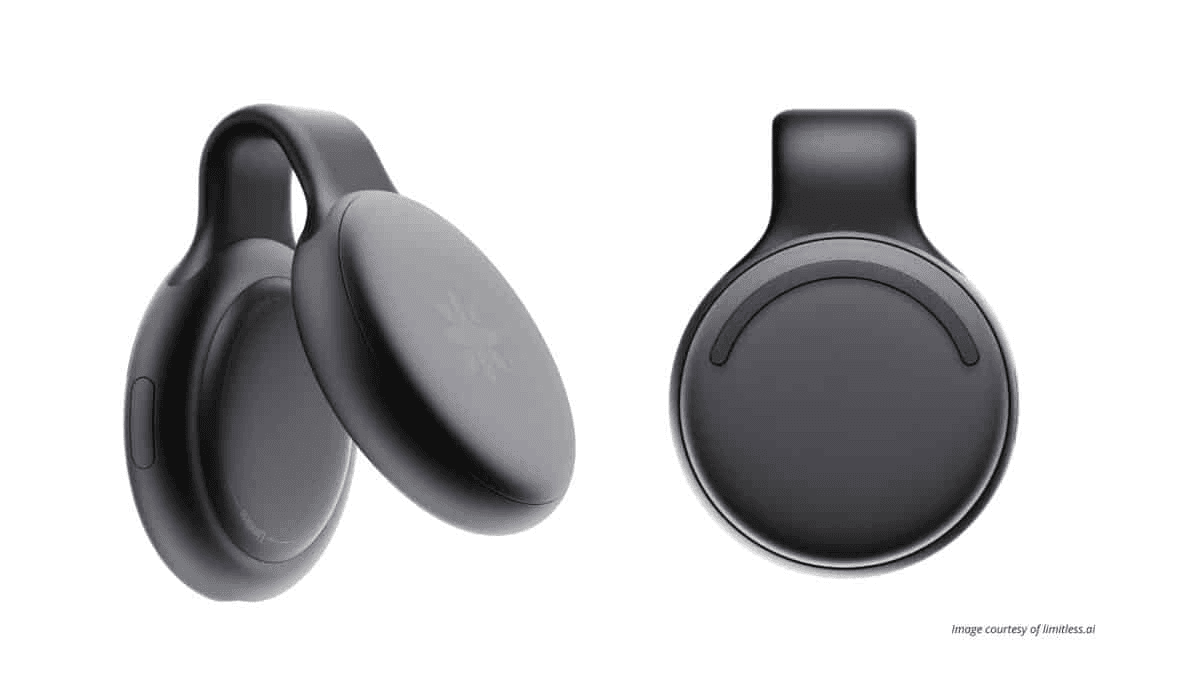
The pendant — source: Digitech
Overview
An audio only input pendant, restricted to a specific environment — workplace. Its mission — become more productive at work.
The Game-changer move
I think constraining the environment could be the winning strategy.
When voice assistants were rising, Siri lost really bad. You could talk to it anywhere, anytime — but because of limited audio capabilities, most of the times you just got “Sorry, I didn’t quite get that”
People have voice assistant PTSD thanks to Siri.
Then Amazon launched Echo, confined to your home, in fact the kitchen initially, where you had specific use cases, “set the timer”. Won the voice assistants’ space.
Similarly, instead of recording everything everywhere (like Tab), they limited it to only at the workplace/meetings, it’s less of a privacy threat and more a productivity tool.
Positioning makes a lot of difference.
Having a tap on you at all times can be scary and invasive to your privacy, but what if it was limited to your company meetings?
AI features: Audio transcriptions, meeting summaries, notes.
AI-UX Interactions
A light indicator when it’s working
Voice input to listen to everything
(may not be the how the launched product functions though)
5. [Secret trio product]

Power-puff girls, silicon valley edition — source: author
Overview
Apparently, Sam Altman wants to build the “iPhone for AI”. Nothing more, nada, no public information. It’s probably not real too.
So why did I mention it? Just tech-gossip :)
The Game-changer move
The people involved.
#1 AI-entrepreneur (Sam, do I need to say who?).
#1 Designer (Jony Ive, Apple’s OG designer).
#1 Investor (Masayoshi, Softbank).
Take my money already!
AI-UX Interactions
Nothing exists but I’m already simping.
6. Apple's ReALM

Tim’s cooking — source: aiverse
Overview
It’s like Siri but but can also view & understand everything on the screen. Apple published it as a research paper, so no demos…yet (but wait 5 weeks, WWDC is just around the corner 🤞)
The Game-changer move
The technical approach.
It’s a tiny model that provides “what’s on my screen?” context to the other AI models, like Siri. It creates a text-based representation of the visual layout, labelling everything on the screen and its location.
It uses an efficient text-only architecture, rather than multi-modal models. Because of this approach, they perform better in “resolution reference” than GPT4.
Resolution reference is understanding ambiguous phrases — “they”, ”that”, “bottom one”, “number on screen”
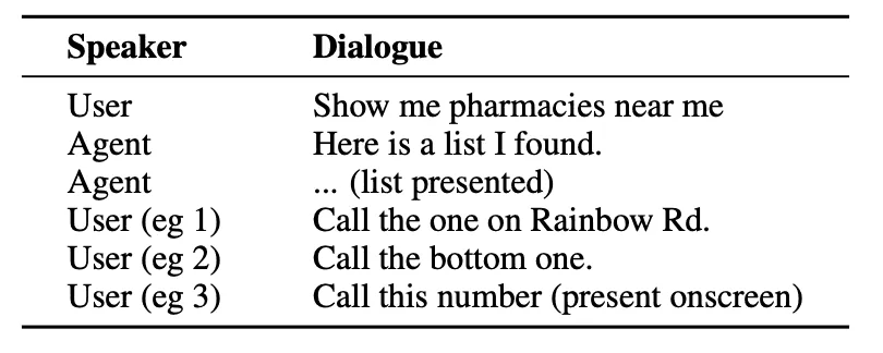
Sample Interactions between a user and an agent — source Medium
AI-UX Interactions
No user interactions, just existing in the matrix. It’s like a spy-ware that you can talk to naturally. Siri on steroids soon.
7. Meta's Ray Bans

Meta Ray Bans worn by the one and only — source: Telegraph
Overview
From Clark Kent to Superman, the magic of Meta’s Ray Bans.
It’s a camera and AI in a frame.
It’s got style too, unlike the Oculus which block half of your face.
The Game-changer move
Linking the glasses with their social apps.
Meta has always been focused on communication, changing the way people communicate. Looking at the glasses from the same POV, they aren’t just an AI wearable anymore. It’s not just ChatGPT in a box, I’m sure there’s more to it.
The current feature of video-calling and sharing your POV directly to Instagram is already augmenting our communication. It’s feels more authentic, it’s more about sharing what I’m seeing, LIVE.
Do I think meta-glasses are an intermediatory step between smart phones and metaverse? Yes.
AI-UX Interactions
I’ve tried out the current version and they are gooood!
You can listen to music without earphones (with their close-to-ear speaker), that too without disturbing your desk neighbours.
The camera quality is impressive, better video quality than the Samsung phone I’ve been for 3 years.
“Hey Meta” voice command to capture photos & videos.
Coming soon, voice commands to analyze what you’re viewing too
8. Brilliant Labs' Frame

Overview
Daily-wear glasses with a screen, camera and AI.
It’s multi-modal and open source
The Game-changer move
They have OpenAI for visual analysis, Whisper for translating and listening, Perplexity for searching the web.
But they went one step ahead — allowing devs to build for the glasses. They have their own AR studio extension using which you can control the various sensors — camera, microphone, display etc. and build your own app.
Kind of like the current app store, but for glasses. The possibilities are endless.
Imaging star gazing without having to hold your phone up.
Imagine being able to shop by just “looking” at the barcodes.
Imagine being able to create a mood-board by capturing images all around the world.
All this is possible with your phone, but now, without your phone too.
Frame is the Android for glasses, Meta Ray Bans feels like the iOS.
AI-UX Interactions
Display to show text and vectors in the glasses itself.
Microphone to listen to any voice commands or other people (to translate live speech)
Motion sensor as gestures — tap, pitch (up-down angle), roll (tilting head left-right) and heading (direction looking at)
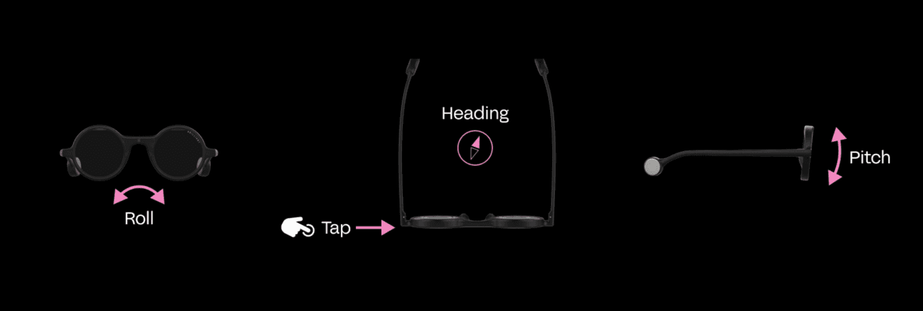
Motion sensor gestures for Frame — source: Frame
And that's the consumer AI mid 2024 update. Thank you for reading.


