Sep 23, 2024
AI-ify your product without adding a chatbot
Best use cases of AI from top companies and startups
AiverseDesign staff
These are a collection of the best implementations of AI, leading to an intuitive UX.
There are total 24 patterns for you to *steal*, and you can find all of them in the “Trending AI-UX Pattern” ebook by AIverse. I’m just going to talk about the 7 I love, but there are many more, and you never know which one hits the spot for your users! (psst.. you can probably get it expensed by your company)
Pattern 1 — Linear back & forth
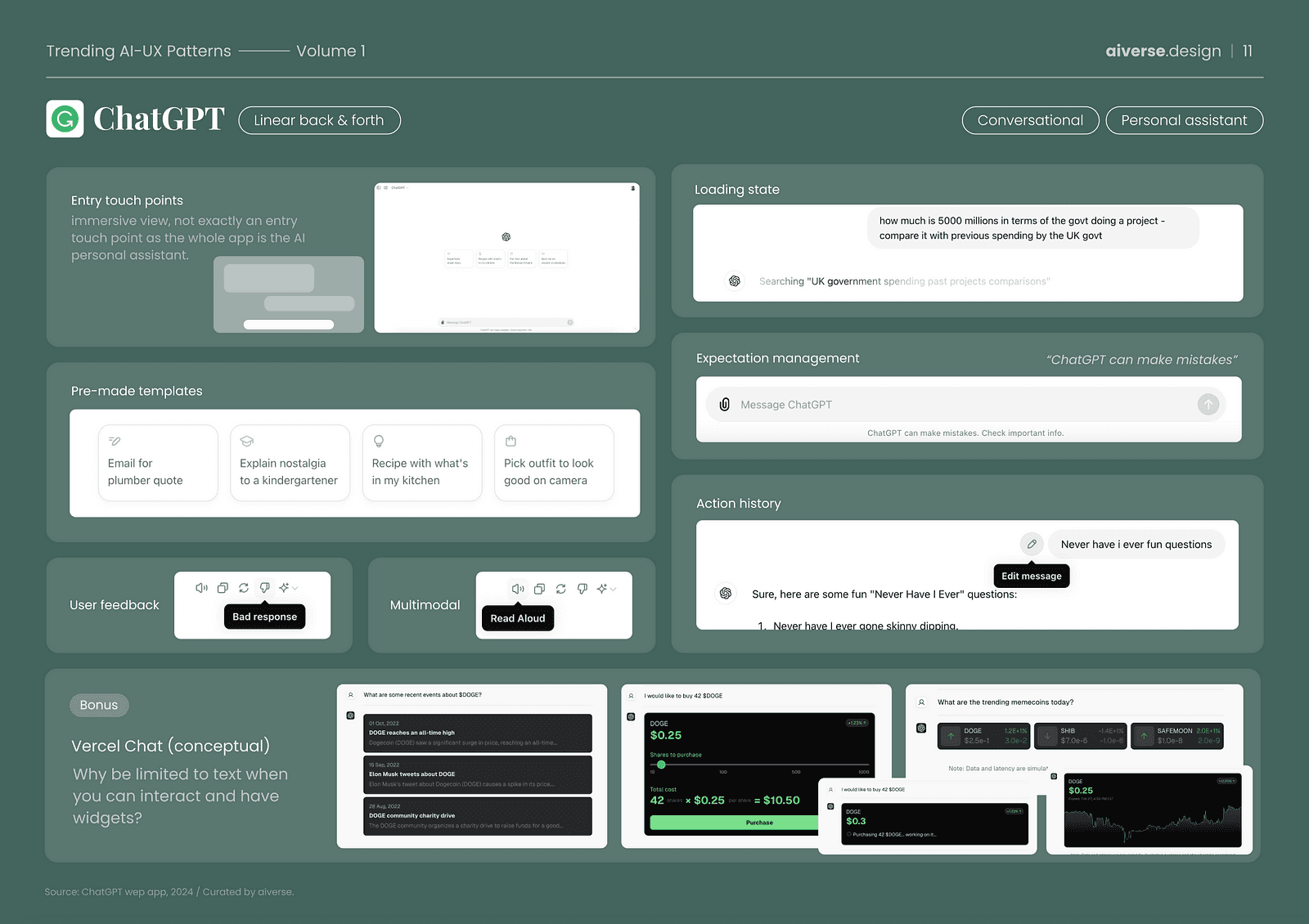
This one’s quite obvious. It’s the one that started it all. ChatGPT’s chat was the first access point to the LLM’s power for all the normies like me. Kinda like CLI in 1960’s but much easier to use. The “chat” UX is what made it easy, intuitive and spread like crazy. And honestly, chat could be answer to your product. What if the chat could help it’s users access the data through a generative UI like Meter’s command? A further extension to this is, what if your product was an API? A part of an over-arching OS based chatbot?
Pattern 2— Non-linear conversation
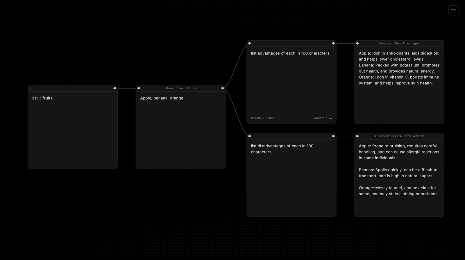
Subform’s non-linear exploration of conversation is aligned with how we humans function as well. We don’t think linearly. We connect dots and ideas. Why shouldn’t our thinking tool too? That’s what Ben South created in just two weeks. *that string animation Oooo*
Pattern 3— Context bundling
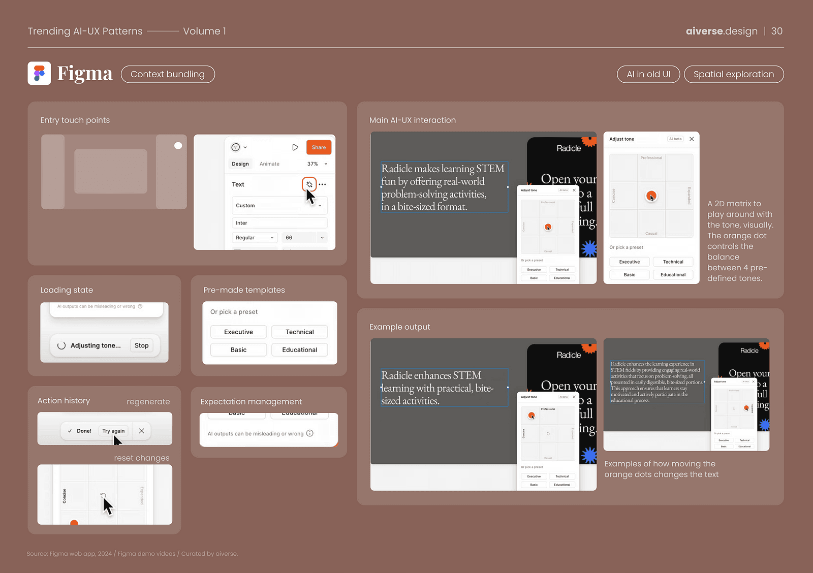
Figma’s dual tone let’s the user adjust the tone of text by dragging the cursor across a 2D matrix. So no more prompting, finding the exact words, you just adjust the tone by visually adjusting the grid. Easy and intuitive. It’s same as prompting, but bundled into a matrix. Could have been a button like Grammarly, but the idea is to bundle pre-created prompts into the existing UI.
Pattern 4— Living documents
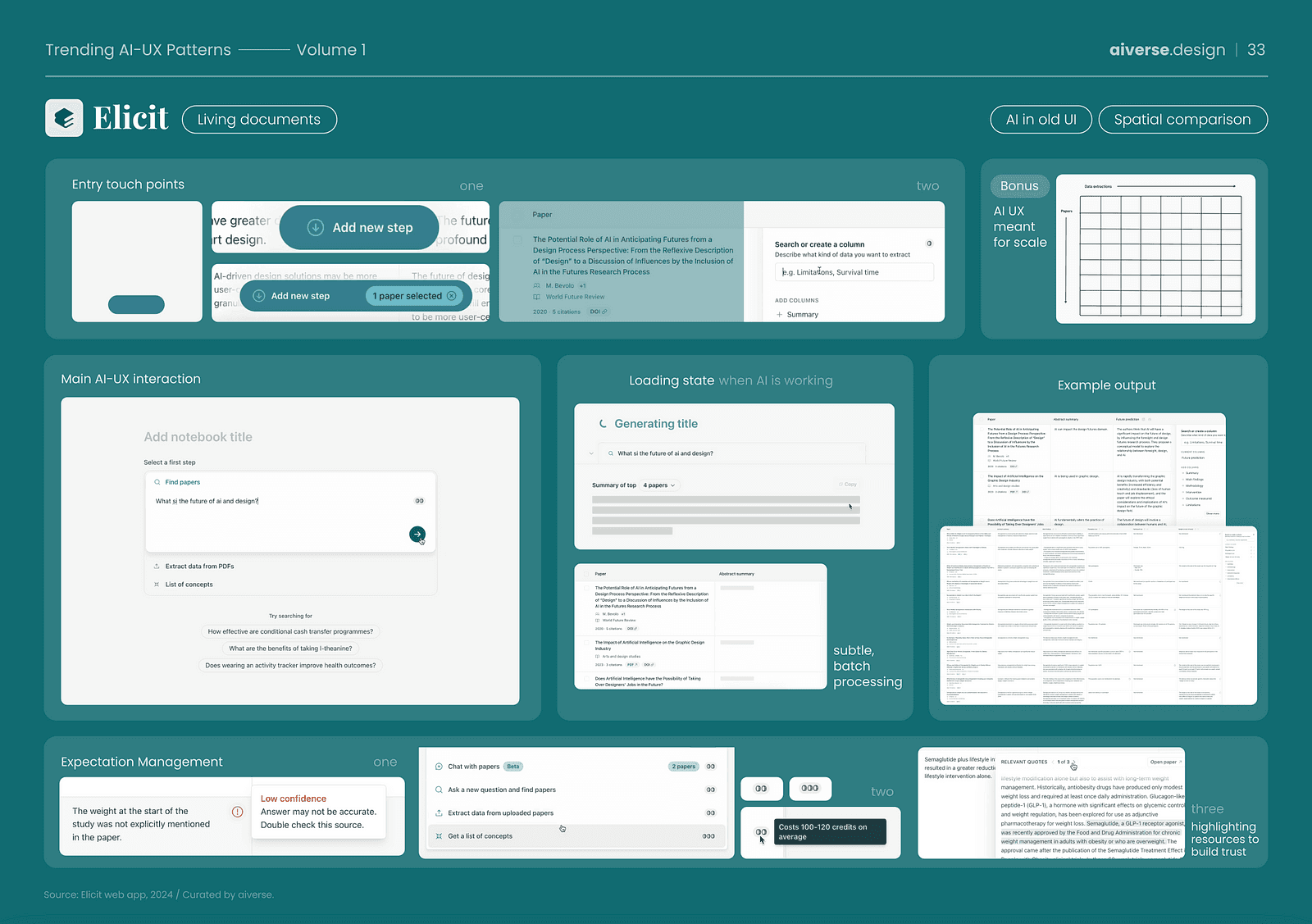
Elicit’s bulk extraction is a perfect example of the hybrid approach to using AI with the existing Excel like UX. These use a subtle animation to bulk-load answers so as to not draw too much attention to the loading state. They also set the right expectations for the user by explicitly highlighting “low confidence” for any answers which may seem uncertain.
Pattern 5— Work with me
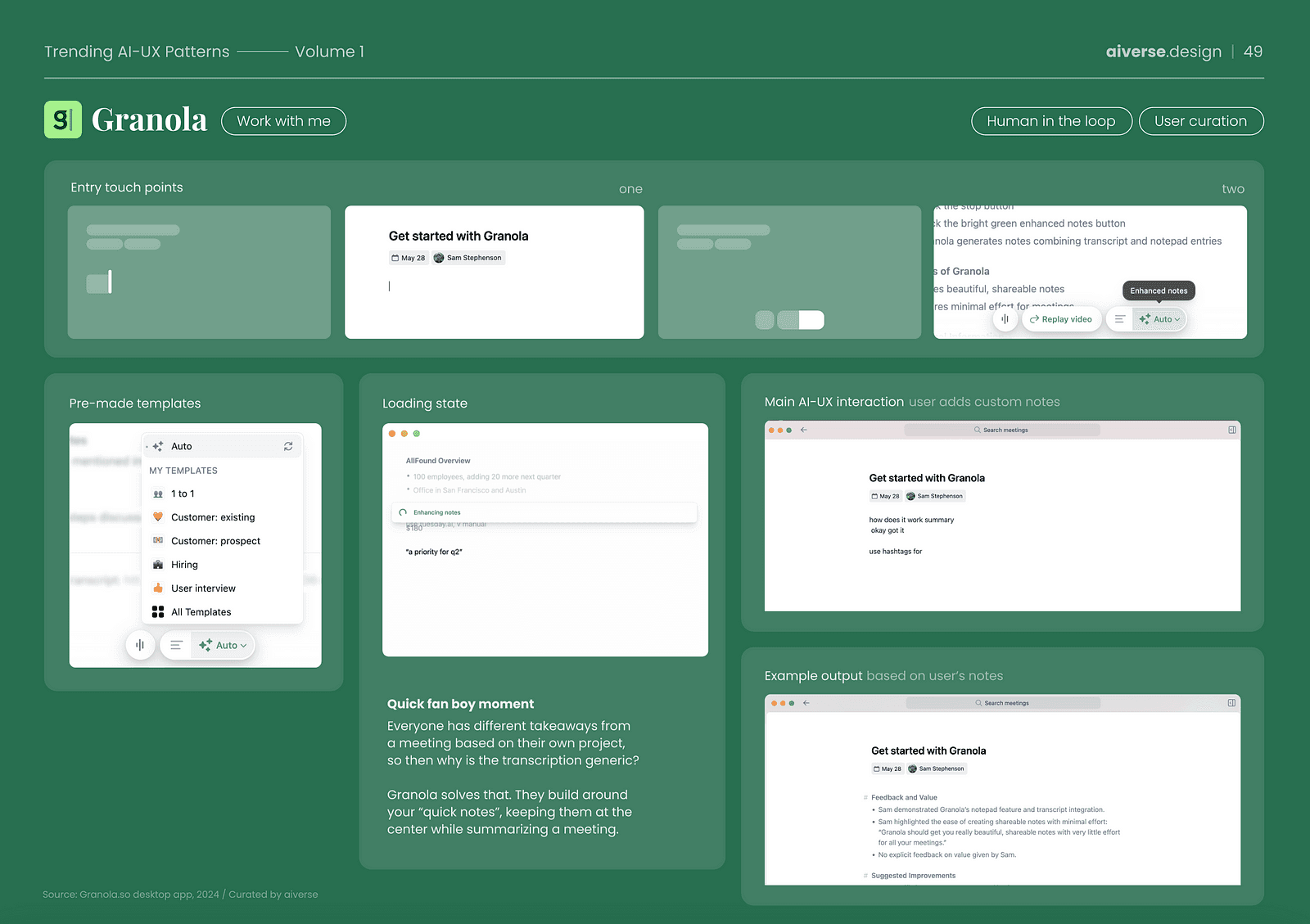
This one’s my favourite. Granola’s summarization is one of the rare examples I’ve come across that nailed the human in the loop trend. They realized not everyone (especially founders of unicorn startups) wants the full transcription of a meeting only to block out the calendar later on to review and extract the important parts. They build the summary of the meeting based on your “rough notes”. The micro-interaction is worth checking out too!
Pattern 6— Highlighting text content
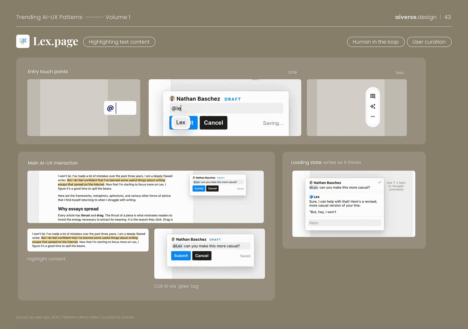
Lex’s “@lex” comment feature is an example of bringing smartness to user’s day-to-day workflow. Microsoft Word and commenting are fundamental to what we humans have been doing since internet. Letting the user curate the output or even their own text by highlighting > commenting is similar to what we do on paper/pen. As someone who writes regularly, this approach gives me autonomy while offering support. No need to switch apps or break your flow.
Pattern 7— You exist?
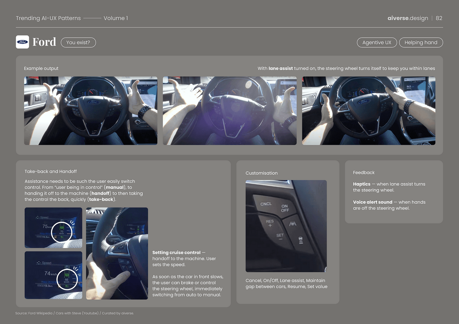
Ford’s lane assist feature is an amazing example of something existing in the background, being switched on to take the control but also quickly giving back the control when needed seamlessly. AI-UX inspiration doesn’t just exist in the digital products, it’s everywhere around us. What started as a “sparkle” button is now making objects around us smart.
A pattern from the Agentive UX macro trend, the AI assistant easily takes control from the user (“hand-off”) and gives back the control without any hindrances (“take-back”). For feedback, it provides not just visual indication but sound alerts for when you let go of the steering wheel and haptics when the system is turning the wheel. It’s a perfect example of clippy-life agent, there when you want it and invisible when not.
Want more AI-UX patterns?
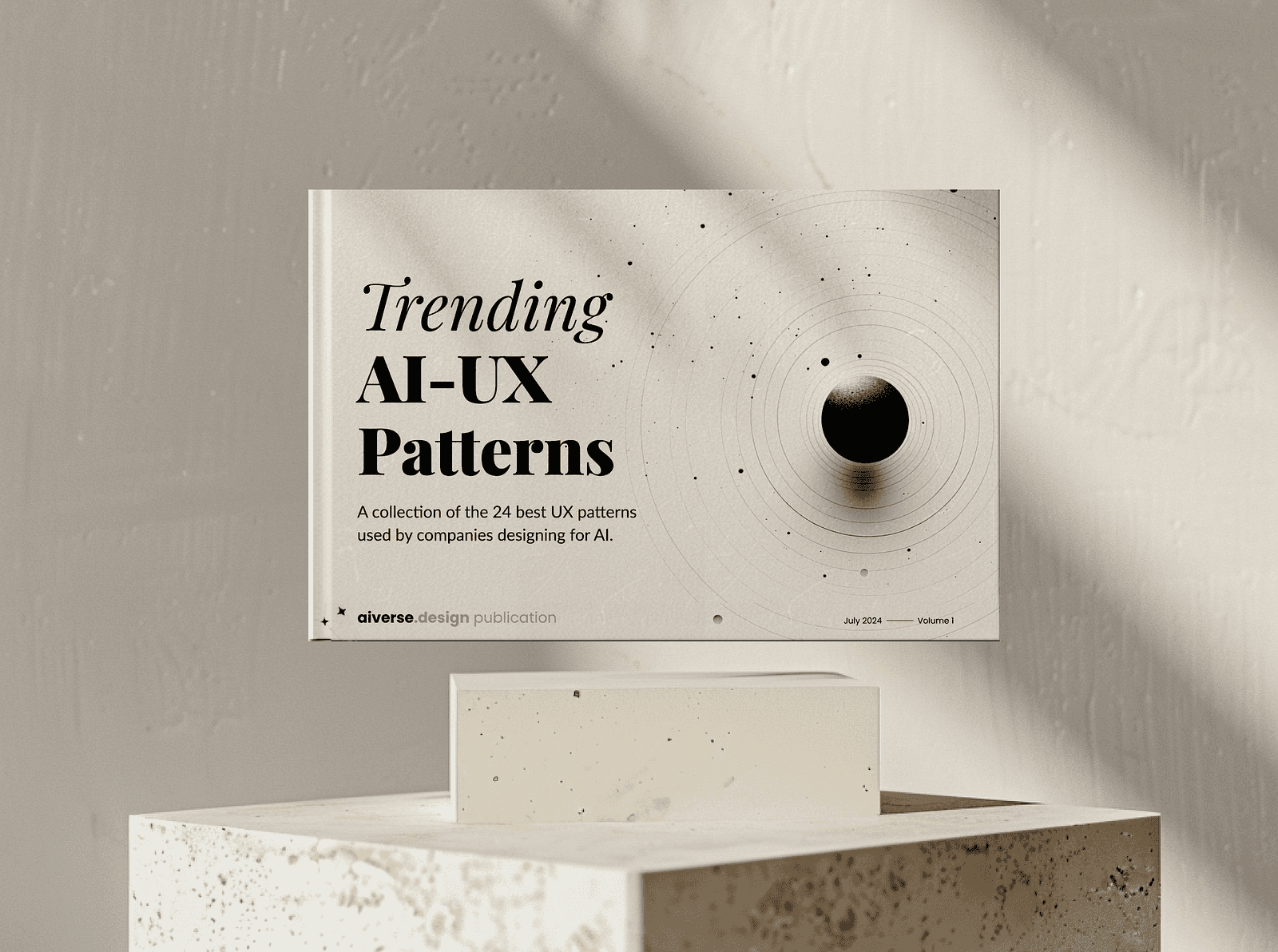
These were just 7 of 24 AI-UX patterns I have identified! If you found these worth stealing, or it got your brain tingling, imagine what more ideas could do! Your next big feature, your “pull to refresh” lies in one of these patterns. Make your product go from good to great.
You can get the complete list of patterns with more real-life examples here. Get it before it becomes mainstream.
Source: All images above belong to the Trending AI-UX Patterns ebook by AIverse.
RELATED INSIGHTS
I spent the afternoon with AI design leaders
An eye-opening experience into the future of design work.

The death of the search bar (as we know it)
A new UX pattern that's quietly evolving every app you use.

A new aesthetic is emerging
Software landscapes: adding emotional context to your product marketing.


Updated weekly with new examples
200+ curated AI interactions
From ChatGPT to Figma AI, explore the best AI UX patterns from leading products.
Join 14,000+ design and product folks