Jul 6, 2023
AI isn't another toy for the techies, it's here to stay!
The UX paradigm shift after 60 years
Kshitij AgrawalCreator of aiverse
Hello from the beyond! This is Aiverse Insights, the only Gucci-wrapped newsletter navigating you through the AI-UX universe - we deliver trends faster than you pick a font.
I read a great post called ”AI: First New UI Paradigm in 60 Years” over the weekend.
It was written by Jakob Nielson - the founder of Nielson Norman (NN) group. And just in case you aren’t familiar with either of those names…
He is known as the father of Usability.
The creator of Jakob’s law, “users spend most of their time on other sites and prefer that new sites work the same way as all the other sites”. Noticed the blue underlined text (hyperlinks) that turn purple once you’ve clicked them? Yeah, that’s not going away any time soon, it has been there since the very first webpage ever created.
He created the Usability Heuristics (10 rules) that every designer still follows when designing digital products. It’s like a seamless roundabout in a bustling city (read internet), without which all [websites] would be cluttered, chaotic & confusing.
He holds 79 United States patents, mainly on ways of making the Internet easier to use.
So yeah, when Jakob has something to say, I listen.
What’s he saying now? Design is about to change, a change so big that he’s calling it a paradigm shift!
Now lucky for you, I read the whole article so you wouldn’t have to. When I eat read, we all read.
Here are the Voyager’s FieldNotesTM on the top things Neilson had to say:
The introduction of AI in computing is the third UI paradigm.
Now now, you didn’t sleep through the first two, they were just unveiled a long time ago. Think of it as needing a binge-worthy recap for that show you loved but haven't seen in a year. Except here, we're flipping back to the 60-year-old silent black and white films. Here’s a 1 min recap of the first two classics -
1️⃣ Batch processing, the first UI paradigm.
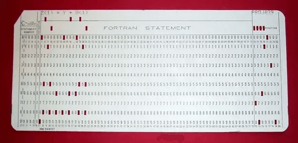
Around 1945, when computers first came around, the user would define the complete workflow, a set of instructions, of what they wanted the machine to do (as a deck of punched cards) and then send it to a data center. They’d get back the result the next morning if they’d done everything right. Even the slightest error, like writing 8 instead of a B would mean no output. It was like trying to bake a cake by mailing your recipe to a distant kitchen. From a UI perspective, there was only a single point of contact between the computer and the user, the batch of punched cards.

a punched card, why am I even bothering trying to decode this?
This reminds me of a Peanut butter & jam challenge I did a while back. If you’re feeling bored, or just want to try something fun, try this activity. Find a friend and on a piece of paper write down the instructions, every little detail, of how they should create a peanut butter/jam sandwich. Once done, they have to follow the exact steps, and I mean the exact steps - so if you miss out on writing “Open the jar by putting twisting the jar cap with your right hand while holding the jar with your left hand” you’re going to be eating a jam-less sandwich.
That’s batch processing, with the only difference being back then it took days to perfect the prompt (instructions) and not minutes.
2️⃣ Command based Interaction, the second UI paradigm.
A paradigm so powerful that it hasn’t changed until now. It involves a back and forth between the computer and user; the command is given one by one & the output, along with the status of the computer, is shown after each command. It's like going from having to know the exact recipe of the cake to having a friendly (back & forth) chat with a chef who shows you pictures, lets you taste & make changes on the fly, and assures you that your culinary adventure will have a delicious ending. Key benefit being that the user can reassess the situation and modify future commands.
It has evolved over 3 generations; command lines to full screen text based terminals to graphical user interface. The latter being the one that dominated the UX world for 40 years, since the launch of Macintosh.
and now, things are changing…
3️⃣ Intent based Outcome Specification, the next UI paradigm.
“With the new AI systems, the user no longer tells the computer what to do. Rather, the user tells the computer what outcome they want.”
The user no longer writes how to achieve the desired output — complete reversal of the locus of control; the computer does everything.

But there are some downsides with the current UX —
the algorithm isn’t transparent; you don’t get to know what actions led to the result or how did the machine create the output
the user is unaware of all possible inputs; either because not everyone is articulate or you can’t consider ALL possible parameters.
If you understood nothing from this, then get this — prompt engineering isn’t going to last long. It’s as good as trained query specialists (who?!) back when Google didn’t exist. They used to search through extensive databases of medical research or legal cases and now, anybody can search.
So the future isn’t replacing the current GUI interfaces with chatbots, but a hybrid of the screen interfaces with AI technology in the background. The hybrid model will unbundle the black box which magically converts the user input to the user desired output.
But it’s not just about being transparent, it’s also about being personal. Rich Barton, the founder of Zillow, Expedia & Glassdoor, calls it the race to intimacy. Everyone’s trying to make the computer connect with the user to a level where it’s a human assistant and is a side effect of our normal actions.
The paradigm is just getting started..
🤔 What’s my take?
Prompts require a user group which can articulate really well, which according to Jakob, half the population can’t. But I predict that an interface where the prompts are broken down into smaller prompts, which assist the user will be the future (short term) going forward. And we see it happening already in various conversational UIs.
All the recently launched AI apps are just UI wrappers to one specific feature that has been made efficient with tech (AI). There’s a lot of unbundling of existing apps going on, which makes sense, apply new tech to every small feature/problem (like what I’m also doing with Splitwise) But ultimately, it’s all going to merge together.
Being able to generate (generic) slides quickly is super cool, yes, but what about the 10 other important things I used to do in Powerpoint like simple editing? Now imagine that BUILT INTO Powerpoint — a better app, and exactly what Microsoft Copilot has been doing.
With the inclusion of AI into the design, we’re transitioning from designing pixels to designing patterns, from digital interfaces to experiences (more smooth, intuitive, and human)!
“Instead of focusing on the design system components that make a login screen — the email field, the password, the pill button — we’ll be imagining new ways to log in that might replace email, phone, or Touch ID.” - Noah Levin, VP at Figma
I don’t want programmers to be at the forefront of the new tech revolution. Design has evolved enough for us to start contributing parallelly instead of waiting for tech to first plateau. That’s going my mission going forward. AIxDesign.
RELATED INSIGHTS
A new aesthetic is emerging
Software landscapes: adding emotional context to your product marketing.

The new AI patterns framework
Behind the scenes into the why, and the what.

A design canvas for your code
What agents have been missing is a surface for exploration.


Updated weekly with new examples
200+ curated AI interactions
From ChatGPT to Figma AI, explore the best AI UX patterns from leading products.
Loved by 2,700+ designers